
Animación con Angular, Signals, Css y SVG
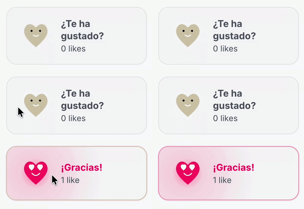
Con las nuevas versiones de angular se puede hacer cosas muy chulas sin necesidad de instalar librerias pesadas de animaciones. En este artículo veras como se hace la animación de like que hay en esta web.
Vamos a montar una micro-interacción para dar like al contenido. Un corazón SVG que cambia de cara, hace un rebote y lanza partículas. Todo con Angular moderno (standalone + signals) y CSS, sin librerías externas.
Concretamente vamos a hacer el boton de like que tenemos en esta web.
Por qué Signals + CSS y no usar una librería
Soy de los partidarios que cuantas menos dependencias usemos en nuestros proyectos mejor. Ya sea por seguridad o por peso de la aplicación. Si algo podemos hacerlo nosotros mucho mejor y en este caso si es solo un botón ... con css es suficiente y suele ser mucho más ligero.
Parte | Quién la hace |
|---|---|
¿Está liked? ¿Está animando? | Signals en TypeScript |
Rebote, glow, partículas | CSS keyframes |
Cambio de cara | Clases + transitions |
Paso 1 — El componente con Signals
Creamos un standalone component. El estado lo guardamos en signals:
import { ChangeDetectionStrategy, Component, signal } from '@angular/core';

@Component({
  selector: 'app-like-button',
  standalone: true,
  templateUrl: './like-button.html',
  styleUrl: './like-button.scss',
  changeDetection: ChangeDetectionStrategy.OnPush,
  host: { class: 'like' },
})
export class LikeButton {
  readonly isLiked = signal(false);
  readonly isAnimating = signal(false);
  readonly showBurst = signal(false);

  giveLike(): void {
    if (this.isLiked()) {
      return; // un solo like
    }

    this.isLiked.set(true);
    this.playAnimation();
  }

  private playAnimation(): void {
    if (window.matchMedia('(prefers-reduced-motion: reduce)').matches) {
      return;
    }

    this.isAnimating.set(true);
    this.showBurst.set(true);

    setTimeout(() => this.isAnimating.set(false), 900);
    setTimeout(() => this.showBurst.set(false), 1000);
  }
}
Qué importa aquí:
isLiked→ estado permanente (liked / no liked)isAnimating→ dispara el rebote (clase temporal)showBurst→ monta las partículas solo mientras hacen falta
Con OnPush + signals, Angular actualiza solo lo necesario.
Paso 2 — SVG en la plantilla (y dos caras a la vez)
Importante: no destruyas la cara con @if. Si montas y desmontas el SVG, el cambio es brusco. Mejor deja las dos caras en el DOM y haz cross fade con CSS:
<button
  type="button"
  class="like__btn"
  [class.like__btn--liked]="isLiked()"
  [class.like__btn--animating]="isAnimating()"
  [attr.aria-pressed]="isLiked()"
  (click)="giveLike()"
>
  <svg viewBox="0 0 100 100" class="like__icon" aria-hidden="true">
    <path
      class="like__heart"
      d="M 50 85 C 20 60, 5 40, 20 20 C 35 5, 50 25, 50 25 C 50 25, 65 5, 80 20 C 95 40, 80 60, 50 85 Z"
    />

    <!-- Cara en reposo -->
    <g class="like__face like__face--calm">
      <circle cx="37" cy="35" r="3" fill="#fff" />
      <circle cx="63" cy="35" r="3" fill="#fff" />
      <path
        d="M 42 48 Q 50 55 58 48"
        fill="none"
        stroke="#fff"
        stroke-width="3"
        stroke-linecap="round"
      />
    </g>

    <!-- Cara feliz (ojos corazón) -->
    <g class="like__face like__face--happy">
      <path
        fill="#fff"
        d="M 37 42 C 28 34, 26 28, 31 24 C 34 21, 37 24, 37 24 C 37 24, 40 21, 43 24 C 48 28, 46 34, 37 42 Z"
      />
      <path
        fill="#fff"
        d="M 63 42 C 54 34, 52 28, 57 24 C 60 21, 63 24, 63 24 C 63 24, 66 21, 69 24 C 74 28, 72 34, 63 42 Z"
      />
      <path
        d="M 38 50 Q 50 64 62 50"
        fill="none"
        stroke="#fff"
        stroke-width="3"
        stroke-linecap="round"
      />
    </g>
  </svg>

  @if (showBurst()) {
    <span class="like__burst">
      @for (i of [0, 1, 2, 3, 4, 5]; track i) {
        <span class="like__particle" [style.--i]="i"></span>
      }
    </span>
  }
</button>
Angular es una maravilla para estas cosas: Añades clases y estilos al SVG igual que en HTML normal.
Paso 3 — CSS: spring, caras y rebote
Dos curvas que ayudan mucho:
$spring: cubic-bezier(0.34, 1.56, 0.64, 1); // overshoot
$soft-out: cubic-bezier(0.22, 1, 0.36, 1);
Corazón y caras
.like__heart {
  fill: #c4c4c4;
  transition: fill 0.4s $soft-out;
}

.like__btn--liked .like__heart {
  fill: #ff0066;
}

.like__face {
  transition:
    opacity 0.28s $soft-out,
    transform 0.45s $spring;
}

.like__face--happy {
  opacity: 0;
  transform: scale(0.35);
}

.like__btn--liked .like__face--calm {
  opacity: 0;
}

.like__btn--liked .like__face--happy {
  opacity: 1;
  transform: scale(1);
}
Rebote al hacer like
Cuando isAnimating() es true, añadimos --animating y disparamos keyframes:
.like__btn--animating .like__icon {
  animation: like-pop 0.9s $spring both;
}

@keyframes like-pop {
  0%   { transform: scale(1) rotate(0deg); }
  12%  { transform: scale(0.72) rotate(4deg); }
  38%  { transform: scale(1.28) rotate(-10deg); }
  58%  { transform: scale(0.94) rotate(3deg); }
  100% { transform: scale(1.06) rotate(-3deg); }
}
Ese “squash → stretch → settle” es lo que da sensación de física sin librería.
Paso 4 — Partículas con distinta física
En vez de 6 puntos iguales, define perfiles distintos (float, arc, spin) y pásalos como CSS variables desde Angular:
readonly particles = [
  { id: 0, physics: 'float', angle: -18, delay: 0, distance: 1.9 },
  { id: 1, physics: 'spin', angle: 28, delay: 40, distance: 1.55 },
  { id: 2, physics: 'arc', angle: -52, delay: 70, distance: 1.7 },
];
@for (p of particles; track p.id) {
  <span
    class="like__particle"
    [class.like__particle--float]="p.physics === 'float'"
    [class.like__particle--arc]="p.physics === 'arc'"
    [class.like__particle--spin]="p.physics === 'spin'"
    [style.--angle.deg]="p.angle"
    [style.--delay.ms]="p.delay"
    [style.--distance.rem]="p.distance"
  ></span>
}
.like__particle {
  position: absolute;
  top: 50%;
  left: 50%;
  width: 0.35rem;
  height: 0.35rem;
  border-radius: 50%;
  background: #ffd600;
  opacity: 0;
}

.like__particle--float {
  animation: particle-float 0.85s ease-out var(--delay) forwards;
}

@keyframes particle-float {
  0% {
    opacity: 0;
    transform: translate(-50%, -50%) rotate(var(--angle)) translateY(0) scale(0.2);
  }
  15% { opacity: 1; }
  100% {
    opacity: 0;
    transform: translate(-50%, -50%) rotate(var(--angle))
      translateY(calc(var(--distance) * -1)) scale(0.2);
  }
}
Para arc y spin, cambia solo el keyframe (arco con “gravedad”, giro mientras viajan). El HTML no cambia.
Paso 5 — Idle y hover
Pequeños detalles que dan vida:
/* Latido suave en reposo */
.like__btn:not(.like__btn--liked) .like__heart {
  animation: idle-beat 3.2s ease infinite;
}

@keyframes idle-beat {
  0%, 72%, 100% { transform: scale(1); }
  78% { transform: scale(1.07); }
  84% { transform: scale(0.97); }
}
En hover puedes guiñar un ojo (ocultar un círculo y mostrar un path de guiño).
Paso 6 — Accesibilidad
@media (prefers-reduced-motion: reduce) {
  .like__btn--animating .like__icon,
  .like__particle {
    animation: none;
  }
}
En TypeScript, si detectas reduced motion, no actives isAnimating / showBurst.